
How to Use The @wordpress/scripts Build Tool with Custom WordPress Blocks
In our last article about how to build a basic block using registerBlockType with no webpack or JSX we covered how to setup a custom block without having to use a build system, jsx and modern javascript that needs to be converted in order to run in browsers that don’t support it jet.
In this article we’ll be covering how to add these things to our callout block. We’ll be using the <a href="https://www.npmjs.com/package/@wordpress/scripts">@wordpress/scripts</a> npm package provided by the Gutenberg development team, which makes our lives super easy.
A Quick Reminder About What We Built Last Time
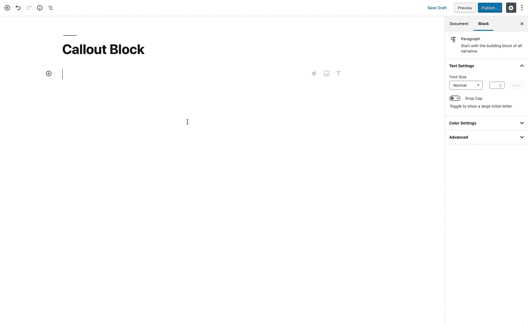
Last time we build a basic callout block, that uses a <RichText /> component, <InspectorControls /> and <PanelColorSettings />, to create a block where we can enter text, change it’s color and the background color of the entire block.
Adding wp-scripts to Our Project
The documentation of the @wordpress/scripts package provides a very clear description of what it’s purpose is.
Collection of reusable scripts for WordPress development. For convenience, every tool provided in this package comes with a recommended configuration.
This allows us to use all the benefits of modern javascript and JSX with a very minimal build system.
Installing Packages with npm
Like I mentioned earlier, @wordpress/scripts is a npm package add to our project. But what is npm? Npm is a package manager, designed and developed to share node-js packages across projects. It since evolved so it doesn’t just get used for node packages, but that is still the essence of it. There is also npmjs.com, which is the official repository of npm packages. But it’s not the only place where packages are hosted. On the other hand npm is not the only way for us to include packages from npmjs.com in our projects. There are also tools like yarn, with whom you can achieve the same goal. We’ll be focussing on using npm to download packages from npmjs.com.
How npm Works
Npm requires a package.json file to be created in the root directory of our project. This JSON file contains some information about our project and a list of all the dependencies and their respective version. We can use the npm cli to initiate our project and create the package.json file. For that we just run npm init inside the root folder of our project and answer the questions it asks us.
All the packages we include in our project will be stored inside a node_modules folder. It is very discouraged to change anything thats inside this folder, because these changes will always get overwritten with new versions or whenever we install the packages on another computer. This folder also shouldn’t be uploaded into git or subversion repositories.
Whenever we have a package.json or package-lock.json file we can run the command npm install and all the listed packages will get the specified version installed.
Adding npm to Our Project
In order for us to use NPM in our project we first need to install nodejs on our computer. You can check wether you already have it installed by typing node -v into your terminal / console of choice. If you don’t have it installed you can get the latest version from nodejs.org.
Once we have node, and therefore npm, installed we can create our package.json file by running npm init like described in the earlier section.
Adding the wp-scripts Package
Now that we have npm up and running we can install the wp-scripts package by running npm install --save-dev @wordpress/scripts. The --save-dev flag tells npm that the dependency is only required for development purposes. If we want to install something that we plan to use on the frontend, like for example a modal library we would just say --save.
If we open up our package.json file in our editor, we can see that the following has been added to it.
"devDependencies": {
    "@wordpress/scripts": "^3.1.0"
}
(The version might be different depending when you are reading this.)
How to Use wp-scripts
The wp-scripts packages comes with a view handy tools:
build: Building a minified production version of our javascript code.check-engines: Checking the Node & NPM version for compatibility.check-licenses: Checking the license of all packages agains your provided license to make sure you are allowed to use them.lint:css: Checking wether the css follows the WordPress coding standardslint:js: Checking wether the javascript follows the WordPress coding standardslint:pkg-json: Checking wether thepackage.jsonfile follows the WordPress coding standardsstart: Starting to watch the javascript files for any changes and compiling it every time something has changed.test:e2e: Running your end to end tests.test:unit: Running your unit test.
You can read more about the intent and correct usage of all of these in the official documentation.
In our example we will focus on the start and build scripts, because these are the most commonly used ones, and all we will need in order to get started.
All we need to do is add the following two lines to the scripts object in our package.json file.
"build": "wp-scripts build",
"start": "wp-scripts start"
With that added we can just run npm start or npm run build, to start watching the files or building the production version.
Updating Our File Structure to Follow the Preferences of the wp-scripts Package
wp-scripts expects our javascript entry-point to be located in a index.js file inside a folder called src. And it will compile this file, and everything we import in it, into a file called index.js inside a build folder.
For clarity stakes we recommend creating another folder called blocks inside the src folder, where we can create a folder for every block we want to build inside a project. Meaning our folder structure would look like this:
+—— callout-block
|  +—— callout-block.php
|  +—— callout-block.css
|  +—— src
   |   +—— index.js
   |   +—— blocks
       |   +—— callout
           |   +—— index.js
|   +—— build
    |   +—— index.js
For projects where you know you will only have one block this is not required, but as soon as you want to have multiple block, this organization makes it a lot easier to find things.
All we need to do now, it to take the code from our callout-block.js file from the first article and move its content into the index.js file inside the callout folder, and import the callout folder in to the index.js file in our src folder.
The import statement inside /src/index.js would look like this:
import `./blocks/callout`;
We don’t need to specify the full path to the index file, because if we import an entire folder, the build process automatically loads the file called index.js.
If we run npm start or npm run build we will see that the build folder with its compiled index.js file gets created.
Because the production file located at /build/index.js folder is the one we want to enqueue in the browser, we need to change the path to the file inside our wp_register_script function in the callout-block.php file to point to this build file.
$block_path = '/build/index.js';
wp_register_script(
    'jsforwp-callout-block',
    plugins_url( $block_path , __FILE__ ),
    [ 'wp-i18n', 'wp-element', 'wp-blocks', 'wp-components', 'wp-editor' ],
    filemtime( plugin_dir_path( $block_path , __FILE__ ) )
);
Thats it. We are now using the build system wp-scripts provides us with. In the next section we’ll take a look at how to leverage modern javascript and jsx, now that out code gets compiled to support older syntaxes.
Converting Our Block to Using JSX and Modern JavaScript
JSX Syntax
In jsx all our components need to be self closing or have a closing element. Even html elements that are not self closing in plain html like the img tag need to be closed at the end. So becomes . But you can also use the self closing tag for every other element if you don`t need any children nested inside it.
wp.element.createElement( type, props, children...  )

// transforms into

<type prop={}>children</type>
so our example of the RichText component will look like this:
 <wp.editor.RichText
    tagName: 'h2'
    className: props.className
    value: props.attributes.content
    style: {
        backgroundColor: props.attributes.backgroundColor,
        color: props.attributes.textColor
    }
    onChange: function( newContent ) {
        props.setAttributes( { content: newContent } );
    }
/>
Some things to keep in mind when using jsx are that there are some reserved words in javascript that conflict with html props. class and for for example become className and htmlFor.
Inside jsx markup we can run javascript expressions by escaping them with curly braces {}.
Transforming Everything to JSX
The only places where we need to change things are the edit and save function of our block. Here we can replace all the wp.element.createElement code with jsx.
edit: ( props ) => {
    return (
        <wp.element.Fragment>
            <wp.editor.InspectorControls>
                <wp.editor.PanelColorSettings
                    title={ __( 'Color Settings', 'jsforwp' ) }
                    colorSettings={ [
                        {
                            label: __( 'Background Color', 'jsforwp' ),
                            value: props.attributes.backgroundColor,
                            onChange: ( newBackgroundColor ) => {
                                setAttributes( { backgroundColor: newBackgroundColor } );
                            },
                        },
                        {
                            label: __( 'Text Color', 'jsforwp' ),
                            value: textColor,
                            onChange: ( newColor ) => {
                                setAttributes( { textColor: newColor } );
                            },
                        },
                    ] }
                />
            </wp.editor.InspectorControls>
            <wp.editor.RichText
                tagName="h2"
                className={ props.className }
                value={ props.attributes.content }
                style={ {
                    backgroundColor: props.attributes.backgroundColor,
                    color: props.attributes.textColor,
                } }
                onChange={ ( newContent ) => {
                    setAttributes( { content: newContent } );
                } }
            />
        </wp.element.Fragment>
    );
},
save: ( props ) => {
    return (
        <wp.editor.RichText.Content
            tagName="h2"
            className={ props.className }
            value={ props.attributes.content }
            style={ {
                backgroundColor: props.attributes.backgroundColor,
                color: props.attributes.textColor,
            } }
        />
    );
},
Modern JavaScript
But just converting it to use jsx is not everything having a build system allows us to do. We can also make use of modern javascript techniques like deconstructing, imports and more.
Using imports
At the moment we are calling our components by referencing the full object. I.E. . This makes everything a bit more cluttered and if we want to use a component multiple times in a project its just a lot of additional typing we don`t need to do.
What import statements allow us to do, is taking components from these packages and just using them in our code.
This means for our RichText component we can add the import statement import { RichText } from '@wordpress/editor'. And from that point forward we can just call the component by it’s name. .
For our callout block we are currently using the following WordPress functions / components:
RichText– wp.editorInspectorControlls– wp.editorPanelColorSettings– wp.editorFragment– wp.element__– wp.i18nregisterBlockType– wp.blocks
therefore our import statements at the top of the file would look like this:
import { __ } from "@wordpress/i18n";
import { registerBlockType } from "@wordpress/blocks";
import { Fragment } from "@wordpress/element";
import {
  InspectorControls,
  PanelColorSettings,
  RichText
} from "@wordpress/editor";
Using Deconstruction
Deconstruction in JavaScript allows us to take properties and methods from objects and using them on their own. this can be archived via the syntax const { property } = object. And we can take it even one step further by deconstructing an object inside a deconstruction. Meaning we can do the following: const { object: { property} } = object. And we can of course take multiple properties or methods by just separating them with a comma ,;
In our blocks this is useful because we are getting things like the className or the setAttributes function passed attached to the props object. But we are also getting another object with all our attributes passed in. Always having to write out the full props.attributes.name makes things more cluttered and also just is a lot of additional typing. So it makes sense to deconstruct everything at the beginning of our edit and save functions.
edit: ( props ) => {
    const {
        attributes: { backgroundColor, textColor, content },
        setAttributes,
        className,
    } = props;
    ...
with that we can now just reference backgroundColor by itself, which makes for much cleaner and more readable code.
Putting Things Together
When we put all of this together we end up with a cleaner, more concise codebase, thats easier to read and maintain.
/**
 * WordPress dependencies
 */
import { __ } from "@wordpress/i18n";
import { registerBlockType } from "@wordpress/blocks";
import { Fragment } from "@wordpress/element";
import {
  InspectorControls,
  PanelColorSettings,
  RichText
} from "@wordpress/editor";

registerBlockType("jsforwp/callout-block", {
  title: "Callout Block",
  icon: "megaphone",
  category: "common",
  attributes: {
    content: {
      source: "html",
      selector: "h2"
    },
    backgroundColor: {
      type: "string",
      default: "#900900"
    },
    textColor: {
      type: "string",
      default: "#ffffff"
    }
  },

  edit: props => {
    const {
      attributes: { backgroundColor, textColor, content },
      setAttributes,
      className
    } = props;
    return (
      <Fragment>
        <InspectorControls>
          <PanelColorSettings
            title={__("Color Settings", "jsforwp")}
            colorSettings={[
              {
                label: __("Background Color", "jsforwp"),
                value: backgroundColor,
                onChange: newBackgroundColor => {
                  setAttributes({ backgroundColor: newBackgroundColor });
                }
              },
              {
                label: __("Text Color", "jsforwp"),
                value: textColor,
                onChange: newColor => {
                  setAttributes({ textColor: newColor });
                }
              }
            ]}
          />
        </InspectorControls>
        <RichText
          tagName="h2"
          className={className}
          value={content}
          style={{
            backgroundColor: backgroundColor,
            color: textColor
          }}
          onChange={newContent => {
            setAttributes({ content: newContent });
          }}
        />
      </Fragment>
    );
  },
  save: props => {
    const {
      attributes: { backgroundColor, textColor, content },
      className
    } = props;
    return (
      <RichText.Content
        tagName="h2"
        className={className}
        value={content}
        style={{
          backgroundColor: backgroundColor,
          color: textColor
        }}
      />
    );
  }
});
If you want to have a look at the entire source code of the block, or download a completed copy of the block, we uploaded everything to a git repository here.
Final Thoughts
First of all, having the wp-scripts package configure all of our build process for us, makes developing custom blocks for the new editing experience so much easier. It allows us to just focus on our product, without having to worry about the build process. And because it allows us to extend its functionality by providing additional configurations we are also not locking us in if we need something more complex in the future.
And the addition of jsx and modern javascript also allows us to focus on our markup and the functionality, with a very readable, concise syntax.
All in all this should give us a solid basis to explore and expand the abilities of the new editor.
If you want to dig deeper into manny of the available components you should check out our Gutenberg Block Development Course .
For More advanced topics there is also the Advanced Gutenberg Block Development which goes very deep into the inner workings of Gutenberg and what you can do with it, including setting up custom sidebars, loading react on the frontend and much more.